Here are a few images from a recent logo design project…
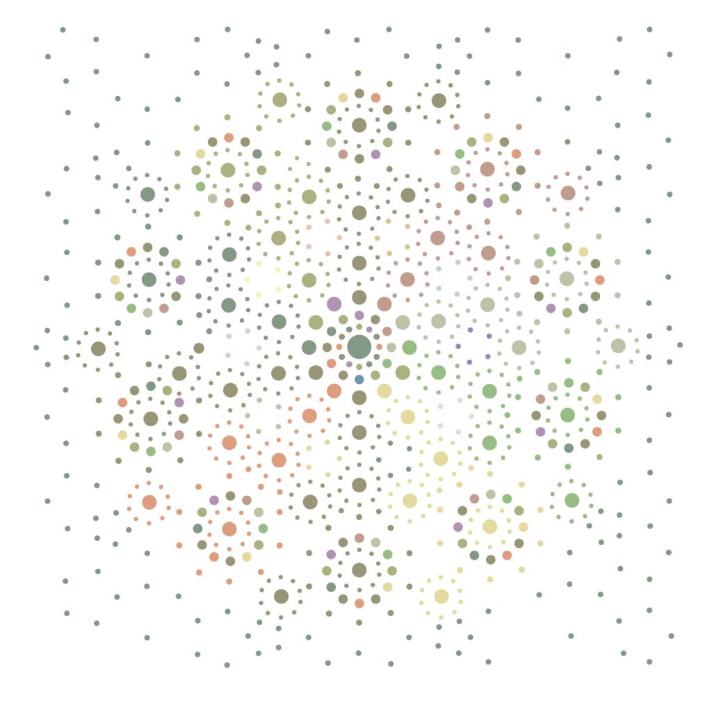
I was so grabbed by the patterns thrown out by x-ray crystallographs at a microscopic level I was determined to create something digitally that felt good and represented the patterns without being too clinical.
It is always fascinating study finding the differences between some geometric designs, that can be so clean that they are often cliche, sterile or hackneyed, and geometric design that draws from natural pattern and may have some ‘feel’ or ’emotional response’ buried in it.
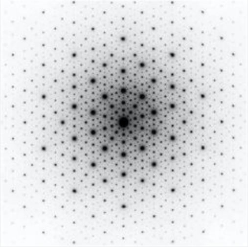
It’s a subjective response as ever, in art, but I felt this work was noteworthy as it has a certain ‘something’.
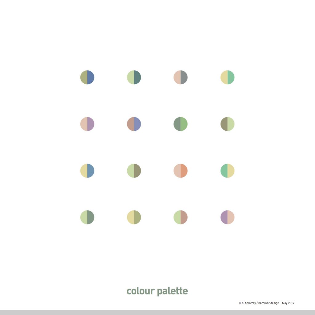
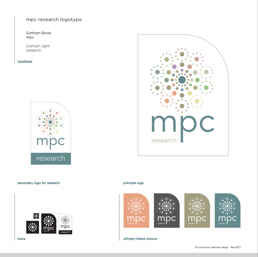
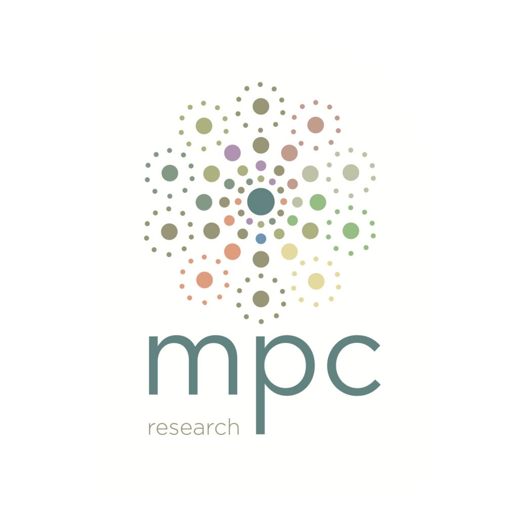
We pursued the initial mass of dots theme and developed a simpler range of icons to create the logotype which Wayne of MPC Research felt was a good representation of his practice and its endeavours.