A few personal visual notes on the importance of muse when developing a product for retail.
Recently, in October 2018, I have finally found something I am happy to turn into a fully fledged product for retail.
It all started in September 2016, talking and laughing with colleagues on the importance of the Peak District to everyone in Sheffield. How important the park is for the ‘get away from it all’ weekend experience and how important it is to just find a space to relax after the stresses of work. It takes a while : )
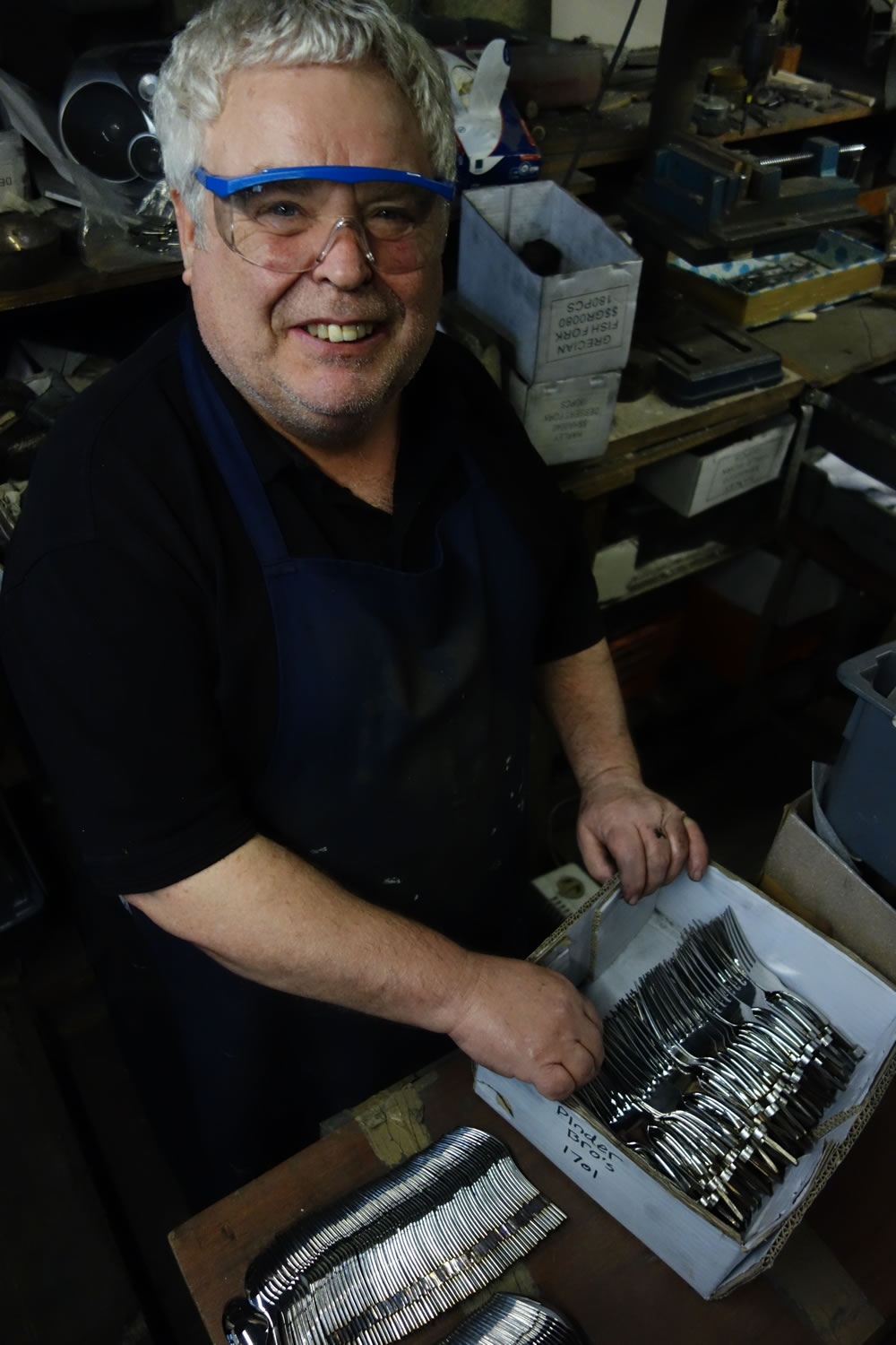
‘Lol’ a lovely work colleague at Pinder Brothers Sheffield’s workshop where I was based 2016-2017.
Many happy conversations were shared on the importance of the Peak Park which got me thinking about how important the whole open space issue is and just how much it means to everyone.
It all started with a few contours and grew into musings on Stanage Edge and a Tee as a product that people could identify with and meant something personal and offered a personal expression of love for the Park.
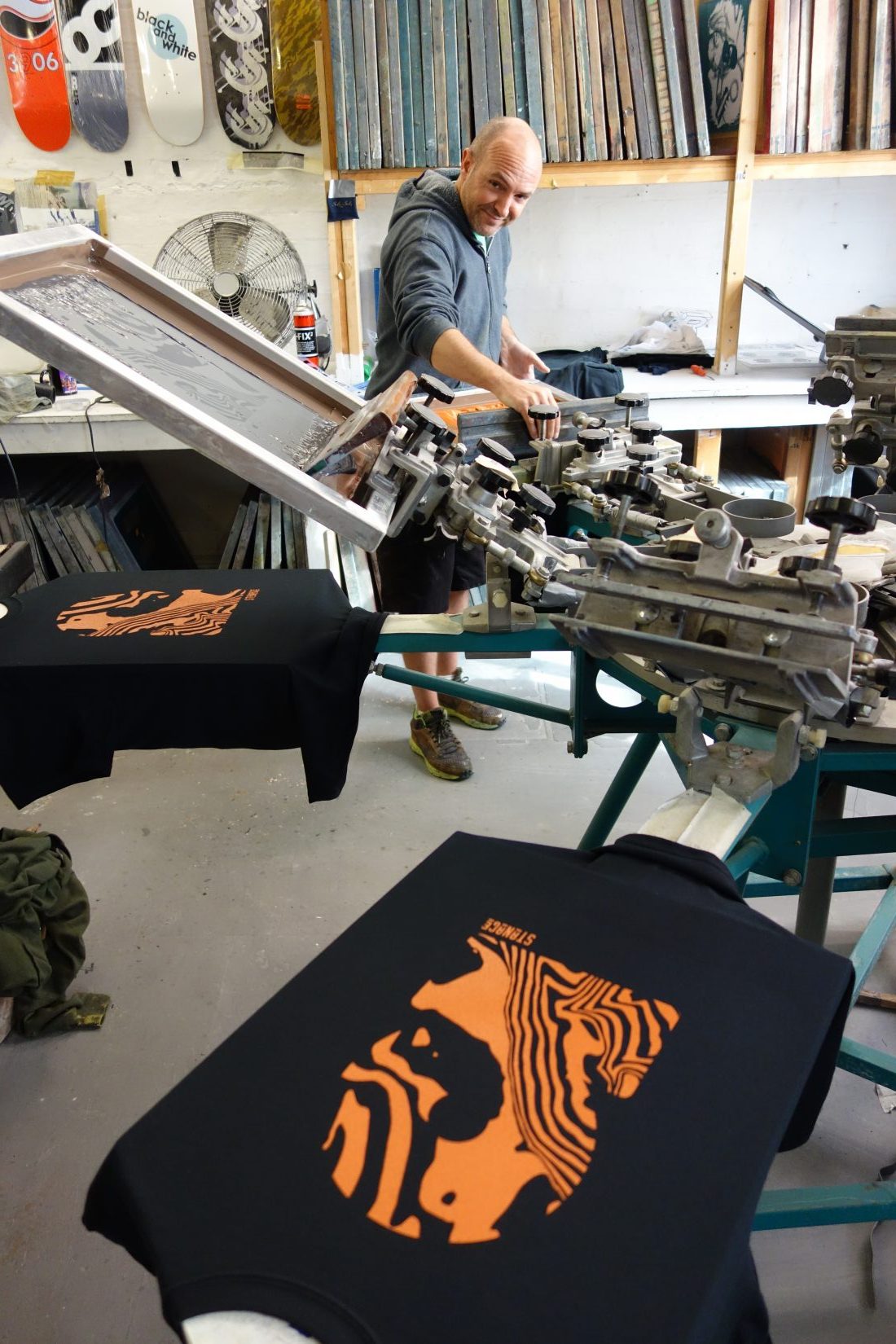
Craig Antcliffe seen here making the first Stanage Tee Shirts at See in Colour next door to Pinder Brothers in the centre of Sheffield.
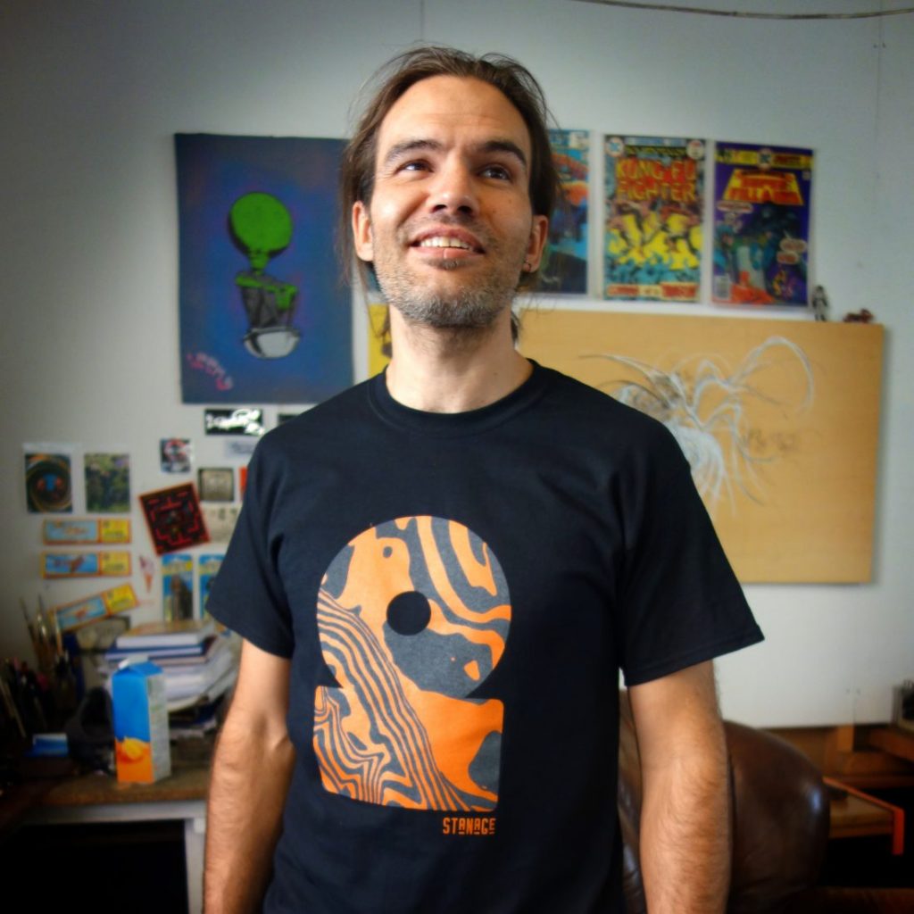
Neil, Craig above’s brother, a famous street artist, seen here sporting the first Stanage Tee.
The tees went down well. In fact they are still going down well, with many proud owners now, but I always felt there was a need to be more ambitious with product design and that there was a need to incorporate the local materials that mean something into a product that says ‘Peak District’. The oak, the gritstone and the stainless steel all kept coming to mind, so I set about pushing to cut the Stanage contours out of Steel a year ago to see what would happen with the design.
Costs proved too prohibitive for me at the time and I had to wait. Meanwhile I kept putting the artwork together in different ways to explore combining colours with the unique shapes of the Stanage Edge contours.
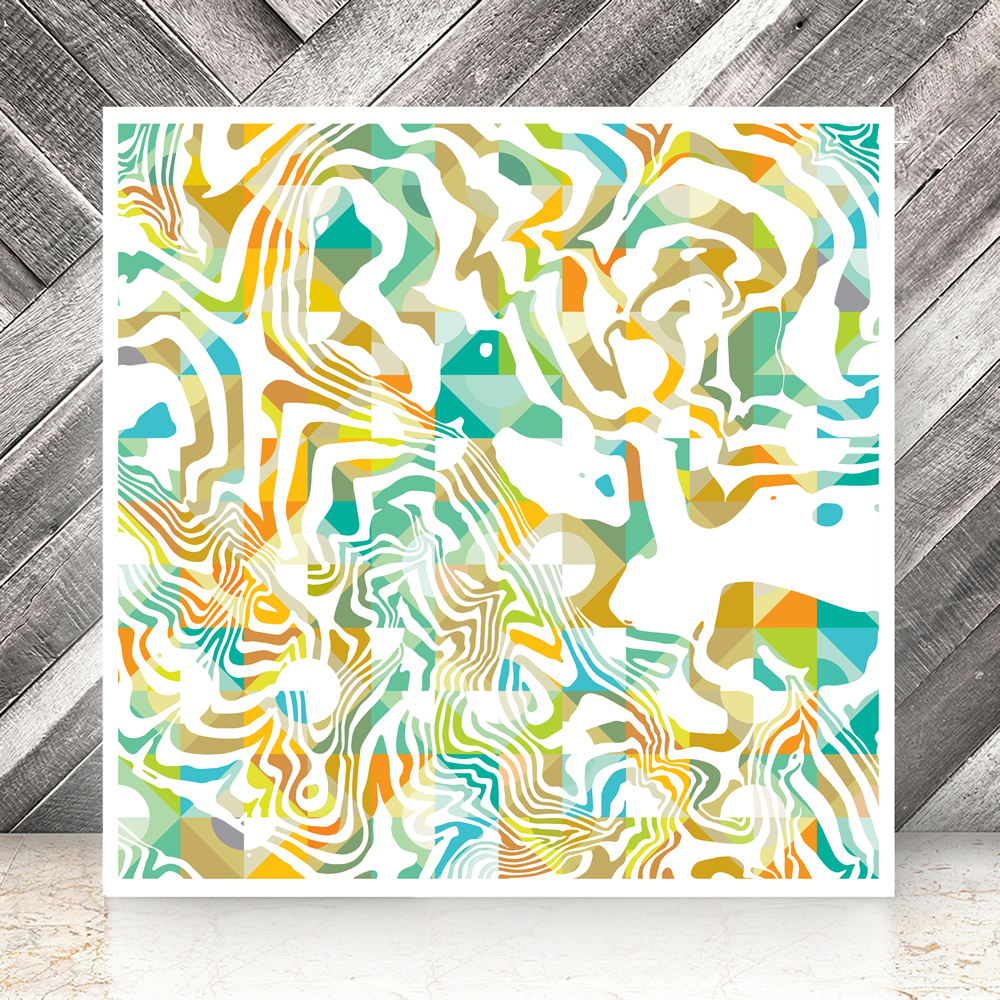
Sunny Stanage was a work that came from a great many experiments in the finding the right contrast between hard edges and erratic edges.
I’m proud of Sunny Stanage work and I can’t wait for it to be a silk scarf in the near future.
Cushions have been made as test samples from this design, very recently, and they look great, but I am straying from the long term Steel project which is the subject of these notes.
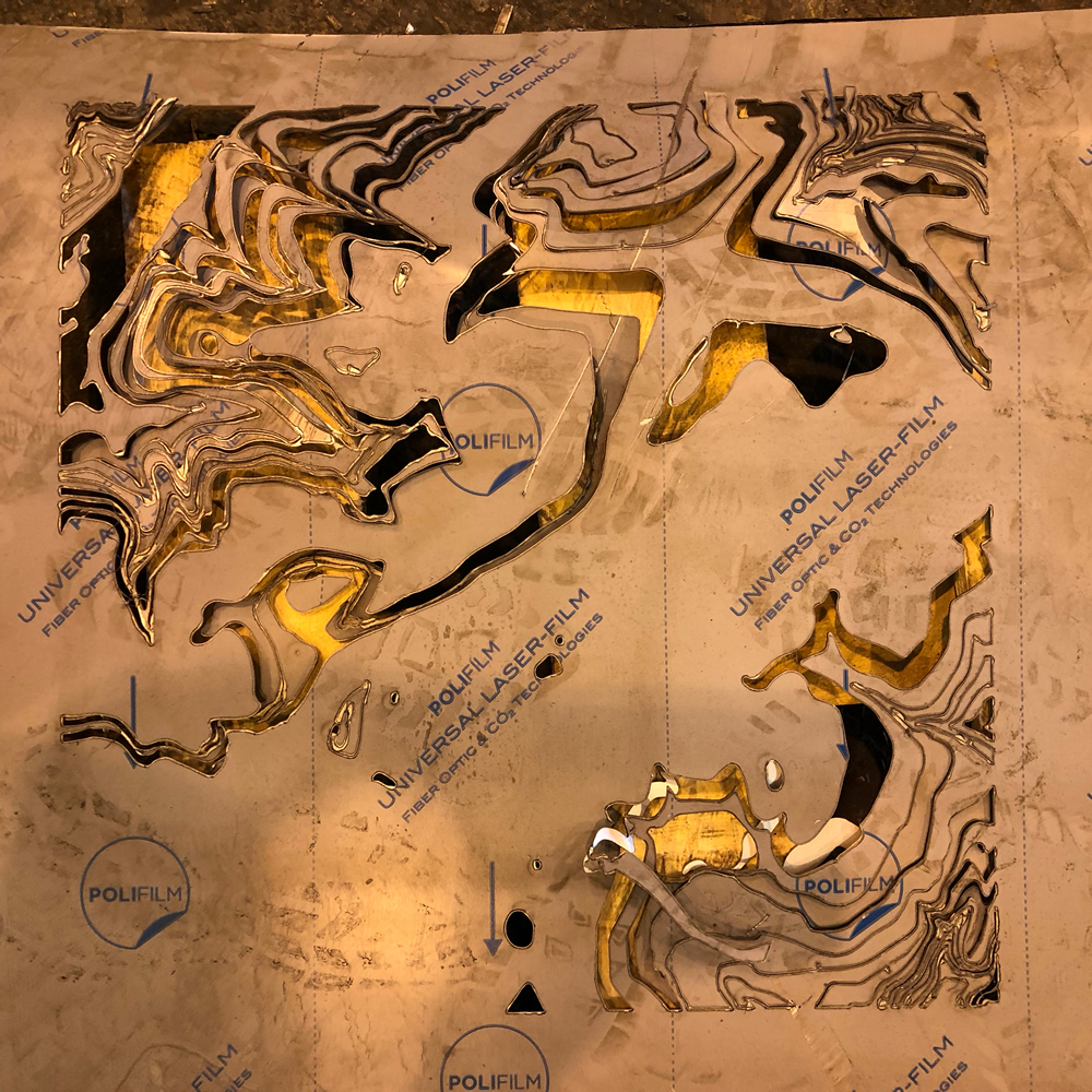
Early experiments proved to be difficult with small sections threatening to damage millions of pounds of Laser cutting machinery at Charles Day Steel in Sheffield. Thanks go to Peter Law for his patience and tolerance as we found a way to success three months later!
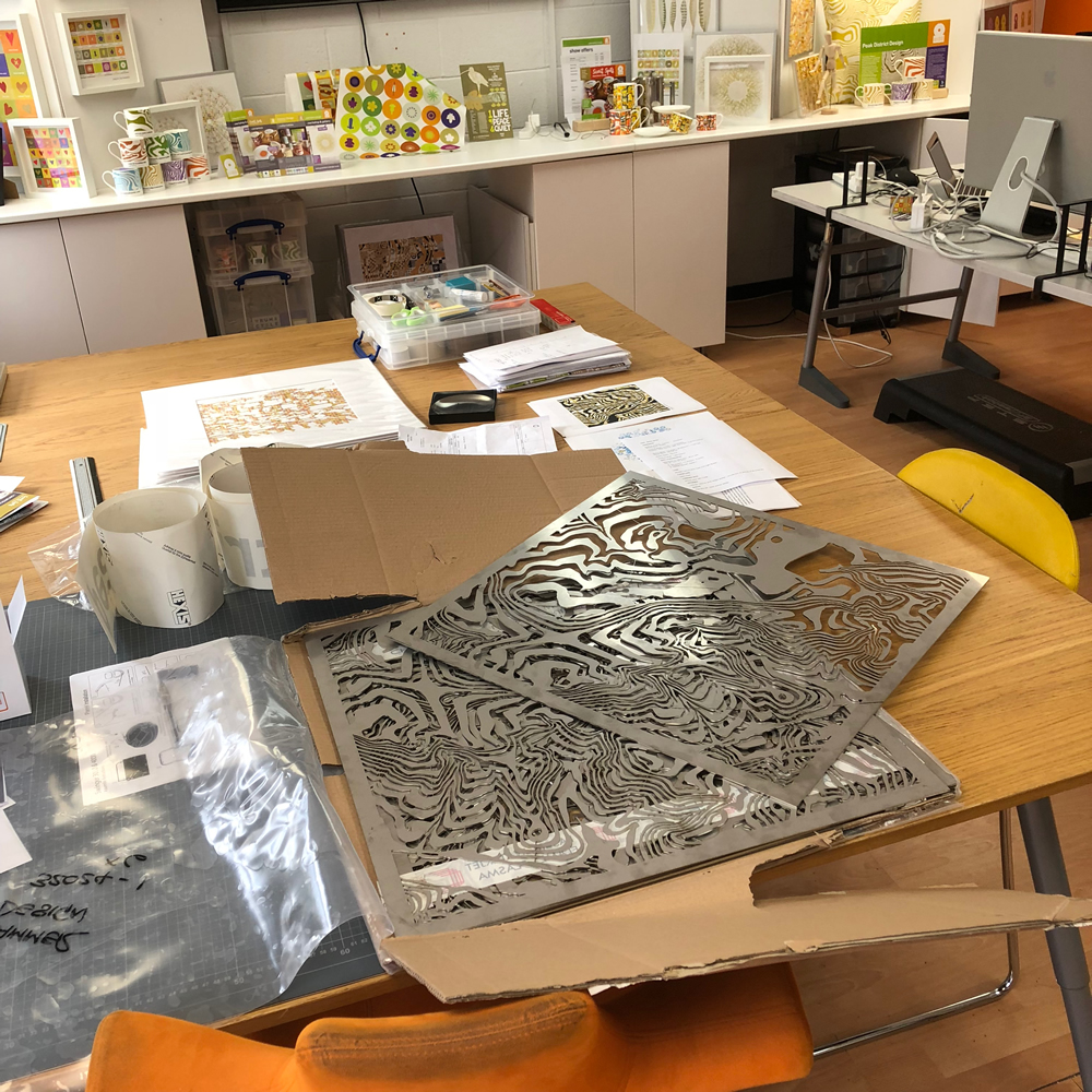
Eventually when the Stainless panels arrived, I was over the moon with the result. Team work had proved effective!
It was time to play…
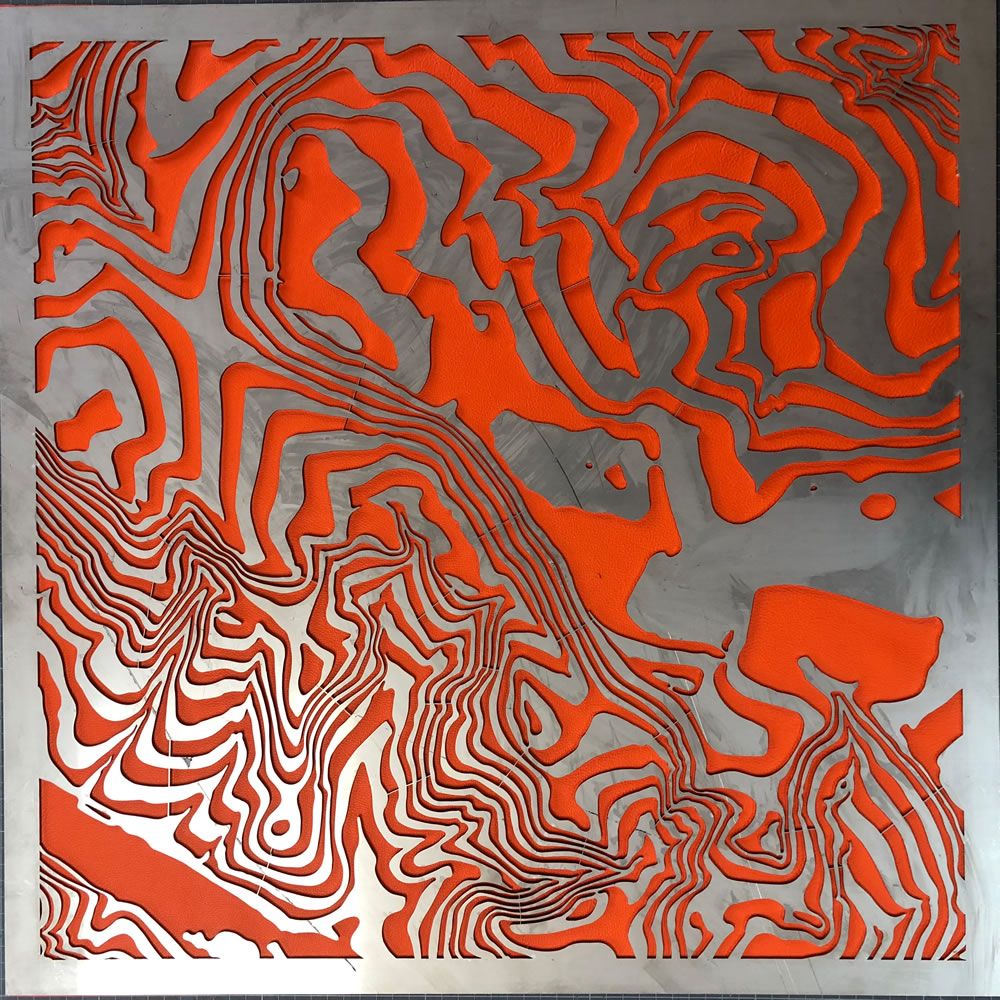
Dirty steel on pristine leather… but still gives you an idea… Part of the musings earlier in 2018 were to combine the Stainless with Orange leather as the contrast was so strong.
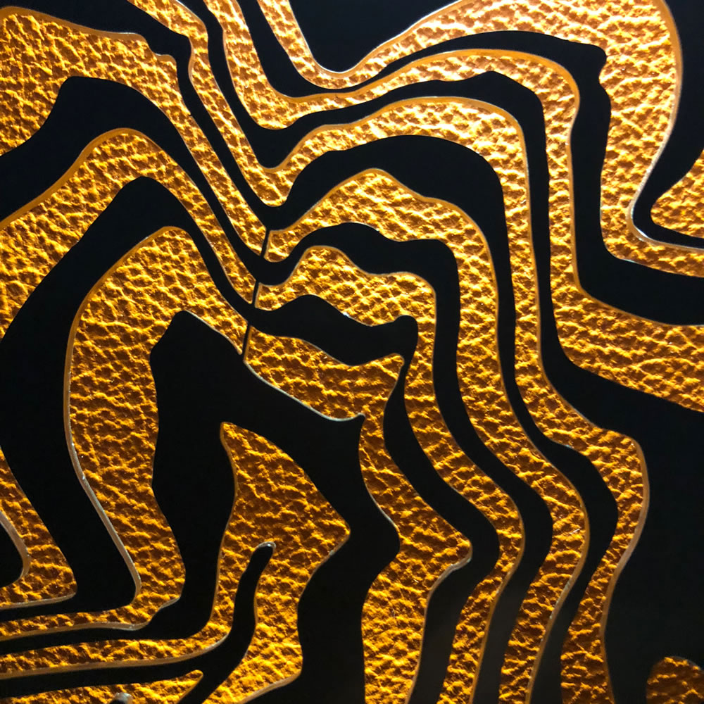
Experimenting with back lighting the 2mm edge of the steel highlights which had proved so hard to fabricate.
So I finally got the idea, the effect the contrast, the colours and the shape and design specification for a table product after just 2 years!
Let’s hope the product is a bit quicker to put together now!
If you’d like to know more, would like to see the table or have any comments please get in touch.
Si Homfray – Oct 2018.