I thought a few personal notes on the process behind producing this logo for the lovely people at Sheffield Sling Surgery might be interesting.
The brief was unusual and in written form came along the lines of ‘I want something I will love’.
My motivation was high as I knew a little bit about the client. Rosie is an interesting character and pours her heart into her work. A passionate campaigner for the benefits of using child slings and a local GP, Rosie’s enthusiasm for her product is an inspiration.
So after the necessary preliminaries of interviewing her and Rob, her husband and business partner, on most angles of her work and the supporting business, it became clear I needed to pull something special out of the bag. I was fearful of any half measures and needed to go for this project with everything I had to date to create some strong work that would hit the mark first time.
So it was pencils out and three days of ground work to cover every conceivable base to produce something that would be heartfelt, appropriate, appealing to the end users and yet remain modern with clean professional lines.
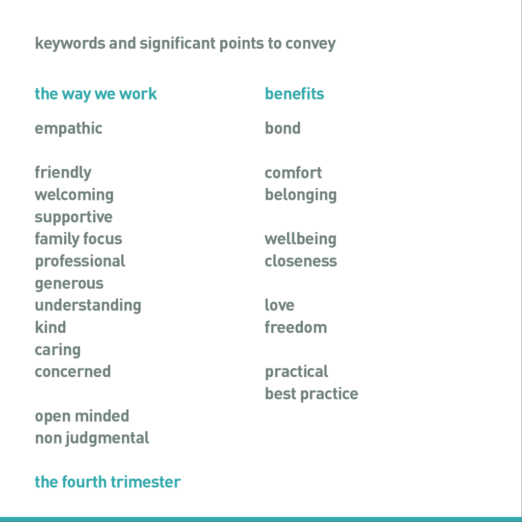
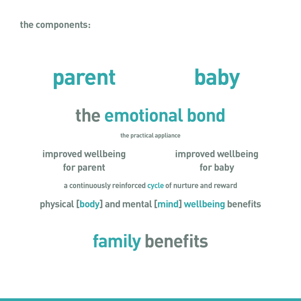
One of the starting points threw out an interesting new approach for me. I found a simple word cloud system gave me a one page point of reference to keep me on track with the frenzy of pencil sketches that were coming out.
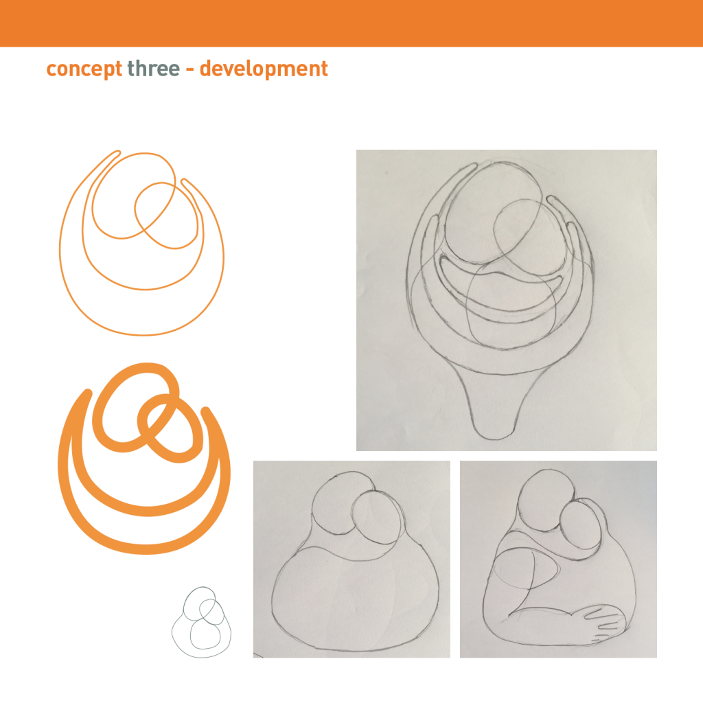
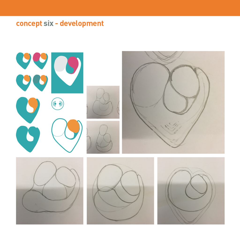
So there was an initial visual presentation of 35 pages [massively edited back] comprising 6 lines of approach. A big PDF, but a simple to follow reasoning of the process.
When you put everything into a project, and you cover all the bases, you usually have a feeling that you have done good and there are usually a few moments in the process where you go ‘yes’ but these sentiments aren’t always shared with the client.
On this occasion I felt strongly about a few of the visuals, and so it was a relief that there was an excited response to this document and we had hit the desired mark.
Phew.

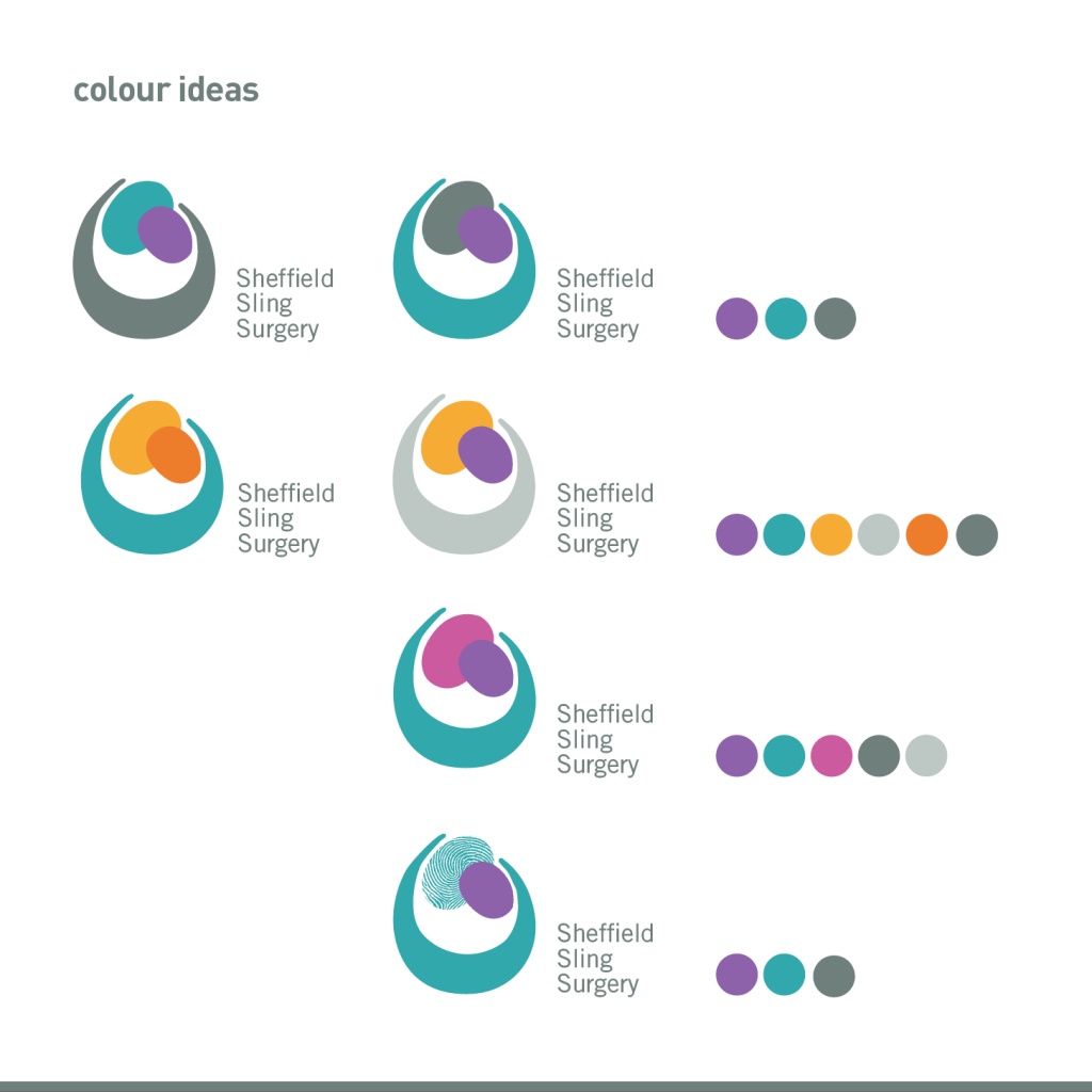
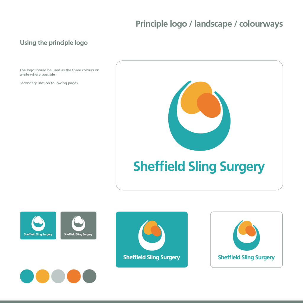
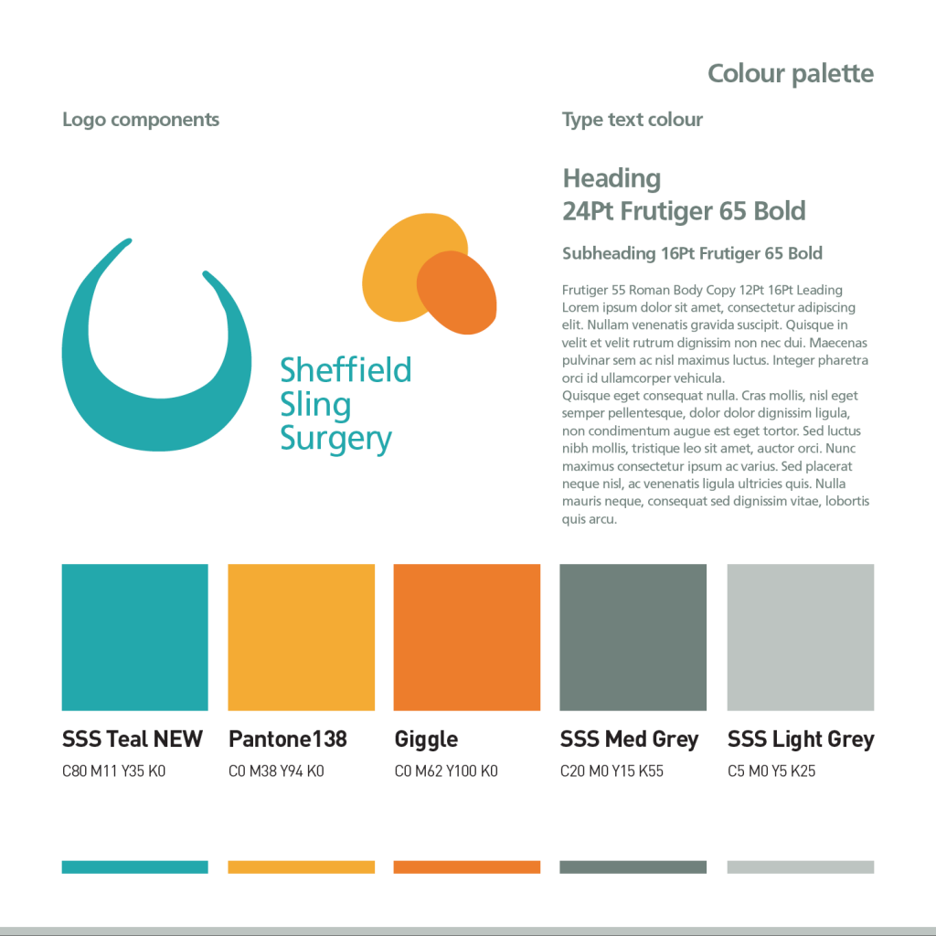
Another few days of work saw the supporting graphics thrown out of the basic premise of the heads logo and teal and orange theme.
It was a heartfelt project and a joy to work on a subject that felt good from start to finish.
It was even more gratifying to practice new techniques and take the time to be totally thorough.
Thanks Rosie and Rob ( www.sheffieldslingsurgery.co.uk and www.sling-spot.co.uk) it was a pleasure.
Si
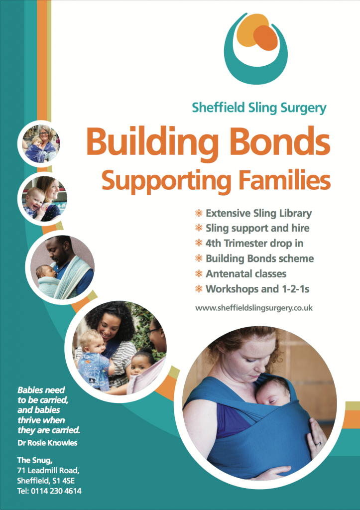
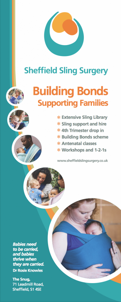
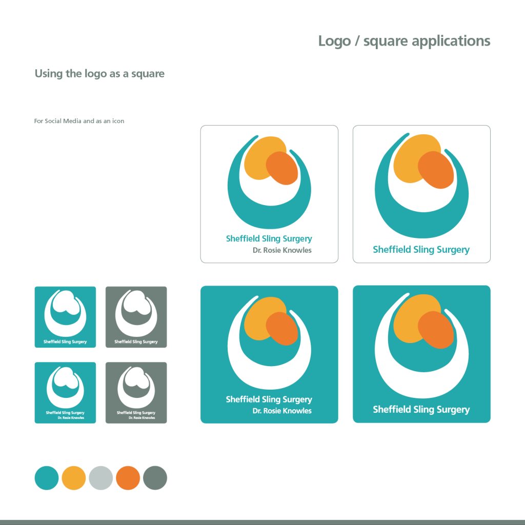
A few finished applications below